I intened to expand on my final project by:
- introducing more of the expelled consumerism vomit
- removing the background movement
- enveloping movement from the character generating more intense purging visuals
- creating frame-by-frame/line-by-line differences
- fixing the last few frames of "happiness" (the mouth)
- zooming the background in when the character is zoomed
- introduce the vomit before the zoom happens to smooth the zoom
- create a possible accompaning piece to show the "aftermath" of the vomit or just a loop of the vomit itself
Wednesday, April 18, 2007
Wednesday, April 11, 2007

Animatics Gone Wild
http://www.animaticmedia.com/animaticsgonewild/
This animatic page is making a response towards the commercial television and the "Too Hot For TV" commercials that come on that advertise certain 18+ things to order like Girls Gone Wild. It's a humoros rendition creating an environment that shows how ridiculous these commercials are and in the animatic, show small things censored and unable to be viewed as if it was "Too Hot For TV".
This animatic page is making a response towards the commercial television and the "Too Hot For TV" commercials that come on that advertise certain 18+ things to order like Girls Gone Wild. It's a humoros rendition creating an environment that shows how ridiculous these commercials are and in the animatic, show small things censored and unable to be viewed as if it was "Too Hot For TV".
Tuesday, April 03, 2007

Final: Storyboard


This character represents consumer culture and all the people that over consume the massive amounts of mainstream consumer products the world has to offer.
The throwing-up represents the manipulation of capitalism through these consumer products and a backlash due to this over-consumption. Throwing-up is not pleasing and is a affect of sickness and a way of ridding the body of something bad and in this case it is discarding "consumerism" from one's self through a physical act.
Tuesday, March 27, 2007
Change v.2
I decided to keep my project ideas that I created in Change and alter the way I aesthetically showed the "change" happen. In the project before, I showed it using overlapping transitions and with this one I decided to use the masking effect to mask out the consumer items.
I took a picture and used multiple animated masks on the one layer to edit out the brand names of numerous mainstream consumer products along with opacity transitions. This is showing some of the same elements that the Change piece did but placing it within a regulated space and giving it a grouding to how consumers actually do over consume.
I took a picture and used multiple animated masks on the one layer to edit out the brand names of numerous mainstream consumer products along with opacity transitions. This is showing some of the same elements that the Change piece did but placing it within a regulated space and giving it a grouding to how consumers actually do over consume.
Wednesday, March 21, 2007
Tuesday, March 20, 2007
Attack on the Authority of the Dominant Culture
Banksy is a graffiti artist that mainly works in stencil work. I am very interested in stencils and have worked with them in my past a lot (even as a concentration). I enjoy the graphic quality of the images and the strict line patterns and static, yet moving intensity that it creates. His works create a new environment within the cities that he creates these artworks in. These artworks directly attack governmental policies, international standings, and civil viewpoints. He makes a humorous connection from the viewer to the artwork with certain pieces.
Do these images cause the people who walk past them and view them to make connections to the government and ask questions to themselves?
Do these images cause the people who walk past them and view them to make connections to the government and ask questions to themselves?
Reasons to Riot
There's a few pieces in the Reasons to Riot exhibition that instantly grabbed my eye. The main piece that is displayed as the advertisement for the exhibition is a very nice collage of elements fundamental to the exhibition. With bright colors in a graffiti-esque sort of way and what seems to be screen prints or transfers with halftone dot patterns that create incredible movement and visually appealing areas of color concentration.
The one that i really like has none of the above qualities. It's a faux-Absolut Vodka advertisement displaying shipment of African slaves uncomfortably crammed into an Absolut Vodka shaped ship with the headline ABSOLUT POWER. The display is a big light box with an opaque white background and black print that projects brightly throughtout the exhibition.
This piece is great to me because I like to keep up with Absolut Vodka advertisements because I find them very intriguing and interesting in the ways they dictate their product with incorporations of different elements. This directly relates the Vodka to another subject with just visual keywords.
Wednesday, March 07, 2007
Self Critique
After reviewing the finished product of my soap commercial, I would of liked to get slightly more into the creation of the advertisement drawings. I would have enjoyed the fluctuating line patterns that animated drawings tend to have but mine were static layers. I would of also liked to incorporate dialogue and create a more interesting environment for these characters to interact in without changing the minimalist feel and the small yet intuative attention to detail. From constructive criticizm, I could make the characters more interactive within the commercial by having them shake some and just move slightly to show life rather than the static characteristics each of them have. Also I could possibly make the grass in the background alter and change with the hatching texture and create even more interactivity.
The idea that I was trying to convey that the character is dirty (depicted through the darker color) didn't go well and possibly conveyed racist qualities. I did not want to have my commercial interpret that and decided to just keep him the same color the entire time. The character then might have a stengent smell, but wasn't well conveyed in the way I displayed it. I could possibly add a sort of Pepe LePu skunk feeling with waves of stench coming off or even a Pig Pen from Charlie Brown approach with pound signs (#) and random lines that seem to float off of the character.
The idea that I was trying to convey that the character is dirty (depicted through the darker color) didn't go well and possibly conveyed racist qualities. I did not want to have my commercial interpret that and decided to just keep him the same color the entire time. The character then might have a stengent smell, but wasn't well conveyed in the way I displayed it. I could possibly add a sort of Pepe LePu skunk feeling with waves of stench coming off or even a Pig Pen from Charlie Brown approach with pound signs (#) and random lines that seem to float off of the character.
Research Package
Consumerism/Capitalism and the Effects of:
Similar:
1. Consumerism
2. Capitalism
3. Free Enterprise
4. Entrepreneurship
5. Producerism
6. Endeavors
7. Consumer Bi-Law
8. Citizen Activism
9. Economics
10. Consumption
11. Globalization
12. Shopaholic
13. Culture Jamming
14. Productivism
15. Theory of the Leisure Class
16. Cycle of Consumption
17. Central Planning
18. Advertisement
19. Status Enhancement
20. Materialism
Opposite:
1. Marxism
2. Elitism
3. Libertarian thought
4. Individuation
5. Additive Cycle of Consumption
6. Private Enterprise
7. Anti-Consumerism
8. Sumptuary Laws
9. Idolatry
10. Pier Paolo Pasolini
11. Social Control
12. Media Theory
13. Neoliberal
14. Artificial Social Pressure
15. Totalitarian Society
16. Monopolistic
17. Sociocultural
18. Fascism
19. Corporate Policy
20. Small Business
Visual Metaphors:
1. Downward spiraling discarded cell phones
2. Crushed cars
3. Galaxy of electronics
4. Chinese art
5. Piles of junk
6. Field of plastic flowers
7. Moon of aluminum
8. Wax of melted cell phones
9. Mosaic of collaged memory cards
10. Collaged credit cards
11. Shards of broken cards
12. Manhole of advertisements
13. Giant consumerism character
14. Presidential form
15. Sequence of advertisements
16. Products as people
17. Junkyard trash
18. Eating products
19. Passing of products
20. Ship of CDs
Contrasting Visual Metaphors:
1. Tree of cellphones
2. Future cars
3. Universal electronic
4. Communist art
5. Junk into food
6. Field of actual flowers
7. Black moon
8. Melted products turned into fuel
9. Blooming collage of data
10. Broken credit cards
11. Ladder of iPods
12. Manhole into nothing
13. Person attacking consumer culture
14. President impeached
15. Sequence of past
16. People discarding products
17. Junkyard trash turned into a product
18. Throwing up products
19. Dead animals
20. Ship dumping products
6 Library sources:
1. Veblen, Thorstein. “The Theory of the Leisure Class”
2. Curtis, Adam. “The Century of the Self”
3. AdBusters magazine
4. Stiegler, Bernard. “The Disaffected Individual”
5. Raico, Ralph. “Liberalism, Marxism and The State”
6. Parkes, Henry Bamford. “Marxism: An Autopsy”
4 Internet sources:
1. Consumerism: Wikipedia –
http://en.wikipedia.org/wiki/Consumerism
2. Media Blog: Sociology -
http://mediablog.typepad.com/media_blog/sociology/index.html
3. Overcoming Consumerism –
http://www.verdant.net/
4. Consumerism Commentary: A Person Finance Blog -
http://www.consumerismcommentary.com/
"Consumer's over consuming"
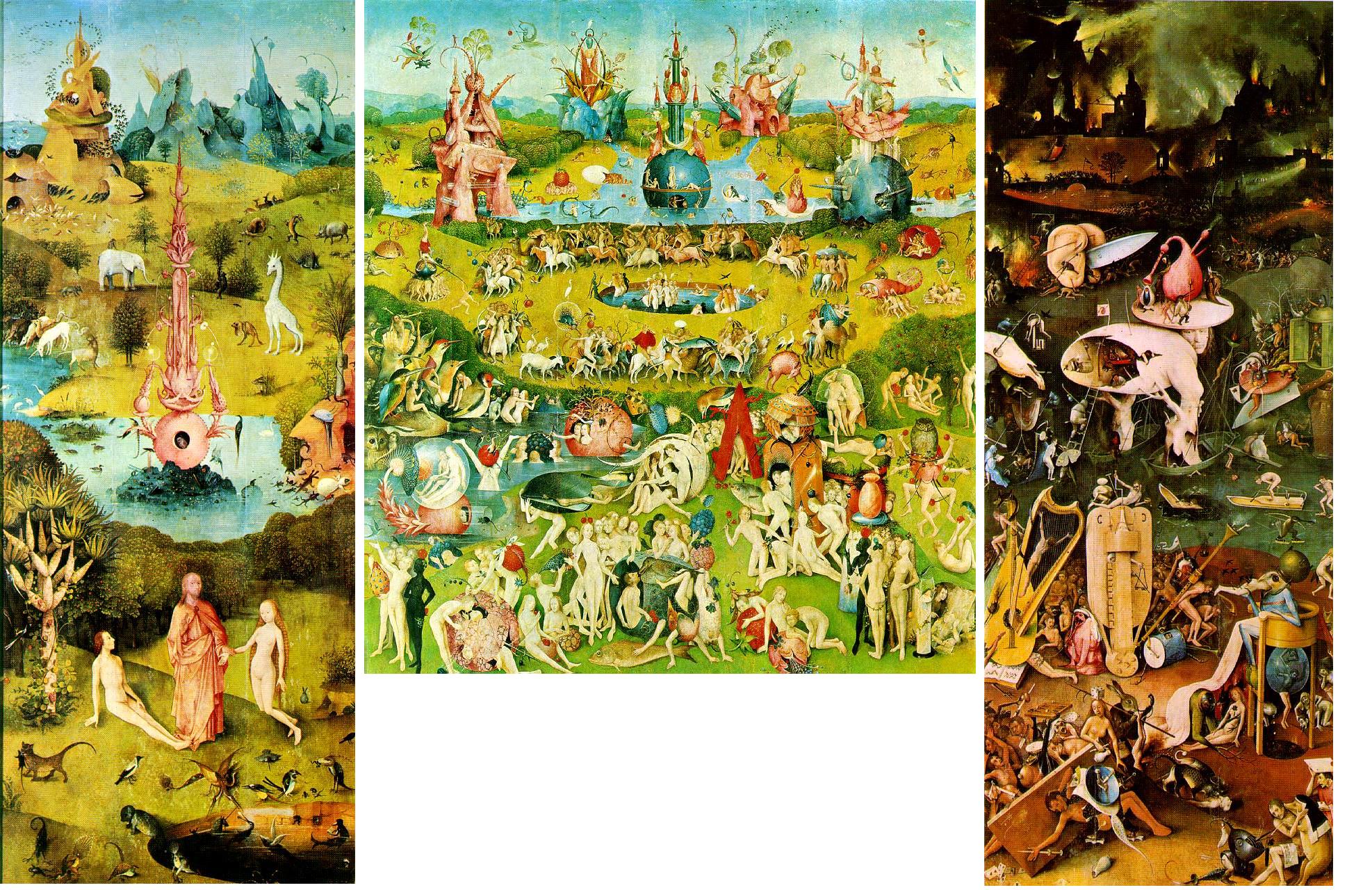
My proposal from this research is to create a distinct and unique depiction of the effect of consumerism and capitalism on individual people and people in general. I would like to go about showing this effect and connection by manipulating the aspects of Hieronymus Bosch's Tryptich "The Garden of Earthly Delights", mostly the third panel showing the afterlife in hell.

The aspects in this third panel I would like to show are the delights that are taken advantage of in the second panel (life) that are then taking advantage of the people in the afterlife.
I am not exactly sure how I am going to show this, but I am intending on making a character that is made up of some of these things but more so related to modern culture and consumerism of the 21st century. This character will attack and try to "consume" people of the world and inturn will dispose of these people in a different form - rather it be mainstream coporate identities, name brands, monopolies, or whatever.
This, in turn, will show the effects that consumerism and capitalism has on people and the world in a sort of reverse cycle where as the typical cycle goes from corporation > product > consumer > outcome and with this one going from outcome (character) > consumer > product/corporation.
I am directly affected by this type of synthesis of consumer culture and am interested in showing a different viewing of it from a perspective of the consumer that consumes because he has to, but knows there's a price to pay.
Similar:
1. Consumerism
2. Capitalism
3. Free Enterprise
4. Entrepreneurship
5. Producerism
6. Endeavors
7. Consumer Bi-Law
8. Citizen Activism
9. Economics
10. Consumption
11. Globalization
12. Shopaholic
13. Culture Jamming
14. Productivism
15. Theory of the Leisure Class
16. Cycle of Consumption
17. Central Planning
18. Advertisement
19. Status Enhancement
20. Materialism
Opposite:
1. Marxism
2. Elitism
3. Libertarian thought
4. Individuation
5. Additive Cycle of Consumption
6. Private Enterprise
7. Anti-Consumerism
8. Sumptuary Laws
9. Idolatry
10. Pier Paolo Pasolini
11. Social Control
12. Media Theory
13. Neoliberal
14. Artificial Social Pressure
15. Totalitarian Society
16. Monopolistic
17. Sociocultural
18. Fascism
19. Corporate Policy
20. Small Business
Visual Metaphors:
1. Downward spiraling discarded cell phones
2. Crushed cars
3. Galaxy of electronics
4. Chinese art
5. Piles of junk
6. Field of plastic flowers
7. Moon of aluminum
8. Wax of melted cell phones
9. Mosaic of collaged memory cards
10. Collaged credit cards
11. Shards of broken cards
12. Manhole of advertisements
13. Giant consumerism character
14. Presidential form
15. Sequence of advertisements
16. Products as people
17. Junkyard trash
18. Eating products
19. Passing of products
20. Ship of CDs
Contrasting Visual Metaphors:
1. Tree of cellphones
2. Future cars
3. Universal electronic
4. Communist art
5. Junk into food
6. Field of actual flowers
7. Black moon
8. Melted products turned into fuel
9. Blooming collage of data
10. Broken credit cards
11. Ladder of iPods
12. Manhole into nothing
13. Person attacking consumer culture
14. President impeached
15. Sequence of past
16. People discarding products
17. Junkyard trash turned into a product
18. Throwing up products
19. Dead animals
20. Ship dumping products
6 Library sources:
1. Veblen, Thorstein. “The Theory of the Leisure Class”
2. Curtis, Adam. “The Century of the Self”
3. AdBusters magazine
4. Stiegler, Bernard. “The Disaffected Individual”
5. Raico, Ralph. “Liberalism, Marxism and The State”
6. Parkes, Henry Bamford. “Marxism: An Autopsy”
4 Internet sources:
1. Consumerism: Wikipedia –
http://en.wikipedia.org/wiki/Consumerism
2. Media Blog: Sociology -
http://mediablog.typepad.com/media_blog/sociology/index.html
3. Overcoming Consumerism –
http://www.verdant.net/
4. Consumerism Commentary: A Person Finance Blog -
http://www.consumerismcommentary.com/
"Consumer's over consuming"
My proposal from this research is to create a distinct and unique depiction of the effect of consumerism and capitalism on individual people and people in general. I would like to go about showing this effect and connection by manipulating the aspects of Hieronymus Bosch's Tryptich "The Garden of Earthly Delights", mostly the third panel showing the afterlife in hell.
The aspects in this third panel I would like to show are the delights that are taken advantage of in the second panel (life) that are then taking advantage of the people in the afterlife.
I am not exactly sure how I am going to show this, but I am intending on making a character that is made up of some of these things but more so related to modern culture and consumerism of the 21st century. This character will attack and try to "consume" people of the world and inturn will dispose of these people in a different form - rather it be mainstream coporate identities, name brands, monopolies, or whatever.
This, in turn, will show the effects that consumerism and capitalism has on people and the world in a sort of reverse cycle where as the typical cycle goes from corporation > product > consumer > outcome and with this one going from outcome (character) > consumer > product/corporation.
I am directly affected by this type of synthesis of consumer culture and am interested in showing a different viewing of it from a perspective of the consumer that consumes because he has to, but knows there's a price to pay.
Wednesday, February 28, 2007
Soap Commercial
This project was one that I became easily interested in because of my heightened interest in advertisements over the past couple of years. I wanted to convey something extremely simple with minimal color and motion. I looked to the Red Bull commercials for some inspiration and my own artistic ingenuity for the creation of this.
The fact that this project was based on an advertisement for soap made it slightly difficult for me because I honestly have no interest in soap commercials but also made it interesting because I had the ability to create something for something not so interesting.
The characters in my advertisement are characters I have come up with and decided to use these characters to create a feel of human qualities but not having that direct association that one would have watching an advertisement and seeing a person they can relate to. Within the advertisement I created a conflict between one character and a group. In short, the group dislikes the one character because he either smells or is just dirty. A friendly character from the group invites the character to use a bar of soap and everyone becomes happy after his bath.
After reviewing the finished product, I would of liked to get slightly more into the creation of the advertisement drawings. I would have enjoyed the fluctuating line patterns that animated drawings tend to have but mine were static layers. I would of also liked to incorporate dialogue and create a more interesting environment for these characters to interact in.
Tuesday, February 13, 2007
Research Topics
1. Graffiti and the urban art world have always been something intriguing to me. I enjoy the act of "finding" the artwork, as it is placed in positions capable of being seen (as is the sole purpose), but are in spots where it might be difficult to view are usually in secluded areas off of highways, under bridges, or on buildings bordering a large road. I already have some previous experience and knowledge in this field, but would like to expand my knowledge of the subject matter by researching it more thoroughly in topics such as governmental conflict, freedom of speech, vandalism, artistic styles, the effects on the public, and the outside perspective on the artwork. I would also like to research more into what the urban artists have to say about their artwork.
2. Simplicity and minimalism have always been things I have been specifically interested in and have directly affected my artwork. I enjoy the wonderful use of negative space simplistic design and artwork creates. I would like to research this topic more to find out certain artists who use these techniques, the steps they take in determining the best way to go about using these techniques, the effect is has on the consumer/visual observer, and how it might have effected post-minimalist artwork.
3. Consumerism can be classified as the consumption the people of an economy have that makes them happy by purchasing products that benefit their economy. This also means that the consumers dictate the economic structure and inevitably the outcome of the consumer culture. This interests me because I am a consumer and everyone in the world is a consumer. Researching the effects consumerism has on art, advertisement, graphic design, and the world as a whole would be something interesting to me because of the fact that it directly affects me and my outlook of the world.
Wednesday, February 07, 2007
Re-Construction
Character Colors:


Reworked Ending:

I decided to use pastel colors that work well together to offer a far less in your face advertisement. The pastel colors tend to push the images back and don't necessarily make them pop out at you. It also gives it the aesthetic feel that I want with dim and dull colors that correspond with the characters and environment.
Wednesday, January 31, 2007
Deconstruction
Advertisements:
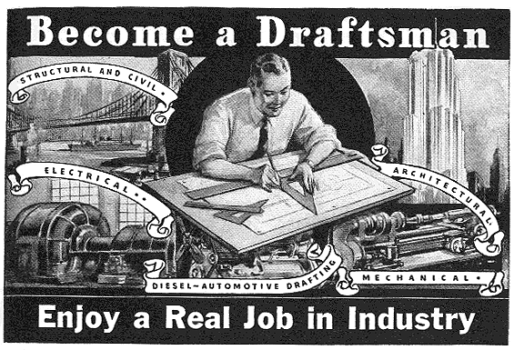
This advertisement reads, “Become a Draftsman/Enjoy a Real Job in Industry” with a picture of a happy white male doing work in the middle of vast industrial imagery. This is just blatantly an advertisement directed to a white majority of the time and implying that some jobs during the time are not real. This also suggests that a draftsman’s job is a really important job – a “real” job.
Due to the inclined production and boost of industry during this time, things like a draftsman’s job would be something desirable. Designing architectural structures, automotives, mechanics and electrics, all are things worth a lot during the time, and are still worth a lot. The fact that a white male is placed in the center being the focus was probably a conscious choice of the time, and wouldn’t really be noticed now as anything different than a regular advertisement. But the fact that it is showing a white male doing this job, and asking for people to become one might show people that this is a job designed for white males, not unlike the majority of jobs in America at this time.
http://youtube.com/watch?v=73PEHI5R8Cg
http://youtube.com/watch?v=kH50-giCeDM
http://youtube.com/watch?v=YtreEgBU3A4


Construction
Soap Advertisement Storyboard:


This storyboarded advertisement is something I have never done before, nevertheless try and come up with an advertisement at all. The advertisement’s inherit quality of persuasion is something I tried to address fully in my personal advertisement.
Soap is something that people use to get clean and stay fresh. In this advertisement, I used characters that I created, in an environment I created, and used a large foreground character as one of the main characters, along with a friend (the character with the soap). The group of people around all has a face of mediocrity because the large foreground character is dirty – dictated by being darker than the others. The “friend” approaches the character with a bar of soap. The character gets sad because of the gesture, but everyone around is instantly happy due to the fact they wont have to deal with the characters lack of cleanliness. The character and his friend go and bath, and even in disgust, the character still goes a long with it because it seems best (peer pressure/group persuasion). The character then “falls in love’ with the friend for helping him become normal and one of the crowd, showing the group crowded around him.
Soap is something that people use to get clean and stay fresh. In this advertisement, I used characters that I created, in an environment I created, and used a large foreground character as one of the main characters, along with a friend (the character with the soap). The group of people around all has a face of mediocrity because the large foreground character is dirty – dictated by being darker than the others. The “friend” approaches the character with a bar of soap. The character gets sad because of the gesture, but everyone around is instantly happy due to the fact they wont have to deal with the characters lack of cleanliness. The character and his friend go and bath, and even in disgust, the character still goes a long with it because it seems best (peer pressure/group persuasion). The character then “falls in love’ with the friend for helping him become normal and one of the crowd, showing the group crowded around him.
Subscribe to:
Posts (Atom)